
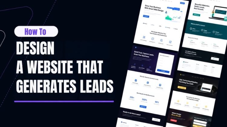
A website should do more than look good. It should bring in business.
Most companies treat their website like a digital brochure. It states what the business does, shows a few photos, and lists contact details. That approach worked years ago. It does not work now.
Buyers research on their own before they ever talk to a salesperson. A large share of B2B buyers are already well into their decision process before reaching out to a vendor. This means your website carries the weight that a sales conversation used to carry. If it does not build trust, answer questions, and guide visitors toward an action, you lose the lead before you even know they existed.
This guide walks through how to design a website built specifically to generate leads. It covers layout choices, form design, trust elements, and the small details that separate a site that just exists online from one that brings in real business.
Truth Box
| Key Point | Insight |
|---|---|
| Multi-step forms outperform single-step forms | Breaking a long form into smaller steps and asking one or two questions per screen increases completion rates compared to showing every field at once |
| Page speed is a conversion factor, not just a technical one | Slow-loading pages push visitors away before they ever see your offer or your call to action |
| Reducing form fields increases conversions | Asking only for what you truly need at the first step, such as an email address, lowers the barrier to converting |
| Mobile-first design is no longer optional | The majority of web traffic comes from mobile devices, so layouts must work for thumbs and small screens first |
| Social proof reduces hesitation | Testimonials, client logos, and reviews placed near a call to action make visitors more comfortable taking the next step |
Why Most Websites Fail to Generate Leads
Many websites are built around visuals first and strategy second. A designer focuses on making pages look polished, then adds heavy images, animations, and scripts on top. The site looks impressive in a portfolio but loads slowly in the real world.
Slow load times, unclear navigation, and vague messaging all create friction. Every extra second of load time or every unclear next step gives a visitor a reason to leave. A lead generation website is not judged by how attractive it looks in a screenshot. It is judged by how many visitors take a meaningful action, such as filling out a form, booking a call, or requesting a quote.
The fix starts with a mindset shift. Instead of asking “what should this page look like,” ask “what should this page get the visitor to do.” Every section, image, and line of copy should support that one goal.
Core Design Elements That Turn Visitors Into Leads
1. Clear Value Proposition Above the Fold
Visitors decide whether to stay on a page within seconds. The space visible before scrolling needs to answer three questions immediately: what you offer, who it is for, and why it matters to the visitor. Avoid vague taglines. State the outcome you deliver in plain language.
2. Calls to Action That State the Outcome
A call to action button is the bridge between interest and a lead. Generic text like “Submit” gives the visitor nothing. Benefit-driven text such as “Get Your Free Quote” or “Start Your Trial” tells the visitor what they receive by clicking. Button color should contrast strongly with the surrounding page so it is impossible to miss, and each page should have one primary action rather than several competing buttons.
3. Lead Capture Forms Built for Completion
Long forms feel like work. Short forms feel manageable. Ask only for essential details at the first step, such as name and email, and collect more information later once trust is established. Splitting a longer form into two or three short steps, rather than one long page of fields, tends to keep more people moving toward completion instead of abandoning halfway through.
4. Trust Signals Near Every Decision Point
Testimonials, case studies, client logos, and star ratings placed close to a form or button reduce hesitation. People look for proof that others have had a good experience before they commit their own information. A single strong testimonial next to a form often does more work than a long paragraph of self-promotion.
5. Site Speed and Mobile Performance
A beautifully designed page is wasted if it takes too long to load. Compressing images, limiting unnecessary scripts, and testing on real mobile devices are not optional extras. They directly affect whether a visitor ever reaches your call to action at all.
| Element | Purpose | Common Mistake |
|---|---|---|
| Above the fold headline | Communicate value instantly | Vague or clever wording instead of clear benefit |
| Call to action button | Prompt one clear next step | Multiple competing buttons on one page |
| Lead capture form | Collect visitor details | Asking for too much information too soon |
| Trust signals | Reduce hesitation | Placing testimonials far from the action point |
| Page speed | Keep visitors on the page | Oversized images and unused scripts |
Building the Lead Generation Funnel Into Your Site
A website that generates leads works like a connected system rather than a set of separate pages. Each page should have a defined role in moving a visitor forward.
Homepage sets first impressions and points visitors toward the most relevant next page based on what they need. Service or product pages go deeper into specific offers and include a direct call to action rather than leaving visitors to hunt for one. Landing pages built for specific campaigns match the message from the ad or link that brought the visitor there, since a mismatch between what was promised and what the page delivers is one of the fastest ways to lose someone. A thank you page after form submission confirms the next step and keeps the relationship moving, rather than leaving the visitor at a dead end.
Search visibility matters here too. A well-structured site with clear headings, fast load times, and mobile-friendly layout tends to earn more organic visibility, which brings in visitors who are already searching for what you offer. Structuring content around the questions your buyers actually search for, and organizing that content clearly, supports both search rankings and user experience at the same time.
Lead Generation Website vs Traditional Brochure Website
| Factor | Lead Generation Website | Traditional Brochure Website |
|---|---|---|
| Primary goal | Convert visitors into leads | Provide general information |
| Call to action | Clear and repeated across pages | Often missing or buried |
| Forms | Short, strategically placed | Long or absent |
| Content focus | Answers buyer questions and objections | Describes the company |
| Performance tracking | Measured against conversion goals | Rarely measured beyond traffic |
| Mobile experience | Designed mobile-first | Often an afterthought |
Industry Context in 2026
Buyer behavior has shifted further toward independent research. Many buyers now use AI tools and digital research as a normal part of evaluating vendors before ever speaking with a sales team. This raises the bar for what a website needs to communicate on its own, without a person there to answer questions in real time.
At the same time, form design has become more adaptive. Instead of static fields shown to every visitor, some sites now adjust which questions appear first based on visitor behavior, showing high-value questions to visitors who show strong buying intent. The overall direction is the same across these shifts: reduce friction, build credibility quickly, and make the next step obvious.
Common Misconceptions
A visually stunning website automatically generates leads. Design quality matters, but without clear calls to action, fast load times, and a logical path to conversion, an attractive site can still perform poorly.
More traffic always means more leads. Traffic without a clear conversion path simply means more visitors leaving without taking action. Fixing the conversion path often produces better results than adding more traffic.
Longer forms collect better leads. Long forms usually just collect fewer leads. Asking only for essential information first, then gathering more details later, tends to produce more completed forms without sacrificing lead quality.
Final Thoughts
A website that generates leads is not an accident. It comes from deliberate choices about layout, messaging, forms, and trust signals, all working toward one clear goal on every page.
Start by auditing your current site with a single question in mind: what is the one action I want a visitor to take on this page, and how easy have I made it for them to take it. Fix the friction points first, then build out the supporting structure of trust signals, speed improvements, and a connected funnel across your site.
Design decisions that seem small, like button copy or form length, often carry the biggest impact on whether a visitor becomes a lead. Treat your website as a working system that supports your sales process, and it will start doing part of that job for you.
Frequently Asked Questions
Q1. What is the most important element of a lead generation website?
Answer: A clear call to action tied to a specific, easy next step matters most. Without it, even strong design and content will not convert visitors into leads.
Q2. How many form fields should a lead capture form have?
Answer: Keep the first step short, often just name and email. Additional details can be gathered in a follow-up step or after the lead is captured.
Q3. Does website speed really affect lead generation?
Answer: Yes. Visitors leave slow-loading pages before they see your offer, which means a slow site loses leads regardless of how good the content is.
Q4. Should every page have a call to action?
Answer: Yes, though the specific action can vary. A blog post might point to a related service page, while a service page should point directly to a form or booking option.
Q5. How long does it take to redesign a website for lead generation?
Answer: Timelines vary based on site size and complexity, but most redesigns focused on conversion take a few weeks to a few months when including testing and refinement.